How to Choose the Right Filament Colors for Your HueForge Model
How to pick filament colors for HueForge prints — tonal value vs hue, building a color stack, substituting colors, and starting with a small versatile palette.
Quick Answer
For HueForge, tonal value (how light or dark a filament is) matters more than the exact hue. Start with 6-10 colors spanning light to dark, including a white and a black. You can substitute colors freely as long as the tonal values match the model requirements.
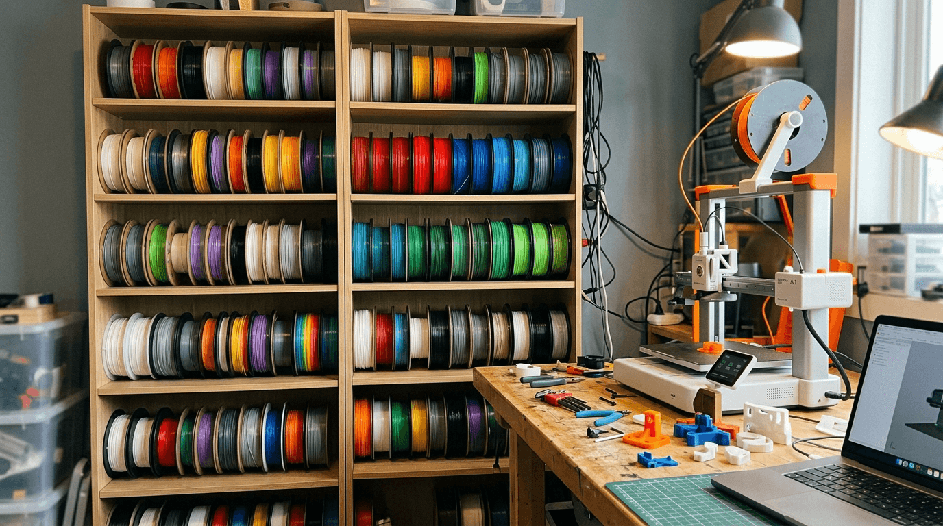
You found a HueForge model you love, you've got a printer ready to go, and you're staring at your filament collection wondering which colors to use. The model listing says it needs four colors — dark, medium, light, and a base — but your shelf has thirty spools and none of them seem to match perfectly.
This is where a lot of people get stuck. Choosing the right filament colors for a HueForge print isn't quite the same as picking paint colors or matching thread to fabric. The colors aren't just sitting side by side — they're stacking on top of each other in thin, semi-transparent layers. What matters isn't just what each color looks like on its own, but how they interact when light passes through the whole stack.
The good news is that you don't need a design degree or perfect color theory knowledge to make good choices. A few practical principles go a long way, and once you understand how layered color works in HueForge, picking colors becomes more intuitive than you'd expect.
How Do I Know What Colors a Model Needs?
Most HueForge model listings include a recommended filament list — the specific brands and colors the designer used when creating the model. This is always the safest starting point, because the designer built the model's layer math around those exact filaments and their TD values.
A typical listing will tell you how many colors the model uses (anywhere from two to eight or more), and it will usually specify them in order from bottom layer to top. Some designers list exact brand and product names. Others describe the colors more generally — "dark brown," "warm tan," "off-white" — which gives you more flexibility but also more room for interpretation.
If you own the exact recommended filaments, you're set. Use them and your results should closely match the designer's preview image. But most people don't have an exact match for every color, and that's where the real decision-making begins.
The key thing to understand is that you're not looking for an exact surface color match. You're looking for filaments that have similar tonal value and compatible TD behavior. A slightly different shade of brown will usually produce a print that looks great — just with a slightly different character than the reference image. A completely different tonal value — swapping a medium brown for something much darker or lighter — will change the print more noticeably.
What's More Important: Exact Color or Tonal Value?
Tonal value wins almost every time. Two filaments can be different hues entirely — one brown, one muted green — and still produce a good print if their tonal values are similar. But two filaments of the same hue at very different tonal values will throw off the whole image.
Tonal value is essentially how light or dark a color appears, independent of its hue. In HueForge, the software is calculating how much light passes through each layer to create gradients of light and shadow. Those gradients depend on the relative lightness and darkness of your color stack more than on the specific hue.
Here's a practical way to think about it. If you squint at a color — blur it in your mind until you can't see the hue, just the brightness — that's its tonal value. A mid-tone brown and a mid-tone olive are closer in tonal value than a mid-tone brown and a very dark brown, even though the browns are the same hue.
This is why many experienced HueForge makers say they choose colors by squinting at their filament collection rather than looking at it straight on. It sounds silly, but it works. You're training your eye to see brightness relationships rather than getting distracted by hue differences that matter less than you'd think.
Of course, hue still matters for the overall mood and feel of the print. A portrait printed in warm earth tones will feel very different from the same model printed in cool grays, even if both versions are technically successful. The point isn't that hue is irrelevant — it's that getting the tonal steps right is the foundation, and hue is the creative choice you layer on top.
How Do I Build a Color Stack That Works?
A good color stack has a clear progression from dark to light with enough tonal separation between each step that the layers create distinct visual depth. If your colors are too close together in value, the print will look flat. If they jump too far, you'll get harsh bands instead of smooth transitions.
Think of your color stack as a staircase from shadow to highlight. The bottom layer is usually the darkest — it forms the deepest shadows in the image. Each subsequent layer is lighter, building up through midtones to the brightest highlights at the top. The spacing between each "step" should be roughly even in terms of perceived brightness.
For a four-color print, a typical stack might look like: black or very dark base, a dark-to-medium tone, a medium-to-light tone, and a light or white top layer. The exact colors depend on the subject — a sunset landscape will use a completely different palette than a pet portrait — but the dark-to-light structure is almost universal.
The most common mistake beginners make is choosing colors that are too similar in value. It's tempting to pick five shades of brown that look beautiful together on the shelf. But if they're all within a narrow tonal range, the HueForge model can't create enough contrast to form a readable image. You need those shadows to be genuinely dark and those highlights to be genuinely light for the picture to emerge.
If you're unsure whether your stack has enough separation, photograph your chosen filaments together and convert the photo to black and white on your phone. If the grayscale version shows clear steps from dark to light, you're in good shape. If everything blends into a similar gray, you need more spread.
Can I Substitute Colors the Designer Didn't Recommend?
Absolutely — and most HueForge makers do this regularly. The key is to match the tonal value and try to use filament with a similar TD value to the original recommendation.
Substitution is where understanding TD becomes practically useful. If a model was designed with a filament that has a TD of 3.2, and you swap in one with a TD of 1.8, the software's preview will no longer be accurate for your print. The layers will interact differently than intended. If your substitute has a similar TD to the original, the print will behave more predictably even if the color is different.
In practice, most substitutions work out fine. Swapping one mid-range brown for another mid-range brown from a different brand will usually produce great results. Swapping a matte filament for a silk, or a translucent for an opaque, is where things get less predictable.
A practical substitution workflow looks like this: check the recommended filament's TD value (if documented), find something in your collection that's close in both tonal value and TD, and if you're unsure, print a small test piece before committing to the full model. Many people print a bookmark or small swatch first as a color test — it uses minimal filament and gives you a real-world preview of how your substitutes look layered together.
How Many Colors Do I Need to Get Started?
Fewer than you think. A well-chosen set of 8 to 12 filament colors can cover a surprising range of HueForge models, and many popular prints use only 3 to 5 colors.
The temptation when starting out is to buy a huge range of colors immediately. Resist it. You'll end up with spools that sit unused for months, and you'll spend money before you know what your actual printing habits need.
A practical starter palette covers the essentials: black, white, one or two grays, a dark brown, a medium warm tone (tan or beige), and then a few colors based on the types of models you're drawn to. If you're into pet portraits, add some fur-adjacent tones. If you like landscapes, grab a green and a blue. If you're printing a lot of people, skin tones become a priority.
The beauty of starting small is that it forces you to learn how colors interact. When you only have ten options, you get creative with your stacks and develop an intuition for what works. That intuition is worth more than a shelf full of unused spools.
As your experience grows, you'll naturally fill gaps. You'll print a model and wish you had a slightly warmer mid-tone, or a darker blue, and that targeted purchase will get used immediately because it solves a specific need. That's a much smarter way to build a collection than buying 30 spools on day one and hoping they'll all be useful.
What If the Model Uses More Colors Than I Own?
If a model calls for six colors and you only have four in the right range, you have a couple of options — and neither of them requires you to buy six new spools.
The first option is to reduce the color count. Many models can be simplified by using one filament where the model specifies two similar shades. If the model calls for both a medium gray and a slightly lighter gray, you might get a good result using a single gray that splits the difference. You'll lose some subtle tonal gradation in that range, but the overall image can still look great. This works best when the colors you're merging are close in value and adjacent in the stack.
The second option is to look for models that match your existing collection. This is where tools like HuePick come in handy — instead of finding a model and then buying filament to match, you can start from the filament you already own and discover models designed around those colors. It flips the workflow and saves both money and shelf space.
Some designers also publish alternate color versions of their models specifically for this reason — a "cool tone" variant using grays and blues alongside a "warm tone" variant using browns and tans. If you see multiple versions available, check which one best aligns with what you already have.
Do Warm and Cool Tones Mix Well in HueForge?
They can, but it takes more care than sticking within a single temperature family. Mixing warm and cool tones deliberately can create beautiful effects — mixing them accidentally tends to make a print feel visually muddy.
In traditional art, warm tones (reds, oranges, yellows, warm browns) and cool tones (blues, greens, cool grays) create visual tension when placed next to each other. That tension can be dramatic and intentional, or it can just look confused. The same principle applies to HueForge stacking.
A stack that goes from warm dark brown to warm tan to warm cream will produce a cohesive, harmonious image. A stack that jumps from warm brown to cool gray to warm cream will have an internal visual conflict in the midtones. Sometimes that conflict is exactly what the image needs. A portrait with warm skin tones and cool shadows can feel more dimensional and realistic. But it needs to be a deliberate choice, not an accident of whatever was on the shelf.
If you're new to this, the safest approach is to keep your stack within one temperature family. As you get more experienced and develop a feel for how colors interact through layers, you can start mixing temperatures strategically. But warm-with-warm and cool-with-cool is a reliable foundation while you're learning.
What's the Best Way to Get Better at Choosing Colors?
Print a lot and pay attention. Every print teaches you something about how your specific filaments behave in practice, and no amount of theory replaces that hands-on feedback loop.
Keep notes — even just phone photos — of what colors you used for each print and how the result compared to the preview. Over time, you'll build a mental library of how your filaments interact. You'll know that your Polymaker Charcoal is a hair more translucent than you'd expect, or that your eSun Bone White reads warmer under LED backlighting.
Start with models that have well-documented filament recommendations and strong community feedback. These give you a reliable baseline to learn from. As you gain confidence, you'll start making bolder substitutions, experimenting with non-standard palettes, and developing a personal color style that makes your prints distinctly yours.
And when in doubt, print small first. A bookmark-sized test swatch of your planned color stack costs almost nothing in material and time, and it will tell you more about how your choices work together than any amount of staring at spools on a shelf.


