
Overwatch 2 Poster – Hueforge Artwork
by Lumpy3D
Tracer leaps into action with her signature pulse pistols drawn, capturing the dynamic energy that defines Overwatch 2's beloved time-jumping hero. The warm amber and bronze tones of her chronal accelerator contrast beautifully against the soft cream background, while fellow heroes gather in silhouette behind her. Lumpy3D's design transforms the game's iconic art style into striking dimensional artwork through clever color layering.
View on MakerWorldRequired Filaments4
Bambu Lab Basic Black
Bambu Lab Basic Blue
Bambu Lab Basic Orange
Bambu Lab Basic Jade White
Why filament details may vary
Filament details (brand, color, and TD value) may not exactly match the designer's original specification. In some cases, the designer didn't specify exact filaments and we've matched the closest options we could find. Always check the original listing for full details.
Some filament links are affiliate links — we may earn a small commission at no extra cost to you. Learn more
Sign up to track your filament inventory and check your matches.
Create accountYou Might Also Like
 - 4C")
Vault Boy - Fallout - Vault 111 (Fallout 4) - 4C
by Side Quest Hues

Slime Rancher Game Poster - Hueforge Art
by Lumpy3D

Pragmata Game Poster - Hueforge Art
by Lumpy3D

Hueforge Spirit Blossom Hwei honeycomb mode
by JGz3DMaker
")
Normal and Acrylic Charizard (2 Print Profiles)
by Side Quest Hues

Kratos - God of War - 4 Colour
by Side Quest Hues
Recent Articles
View all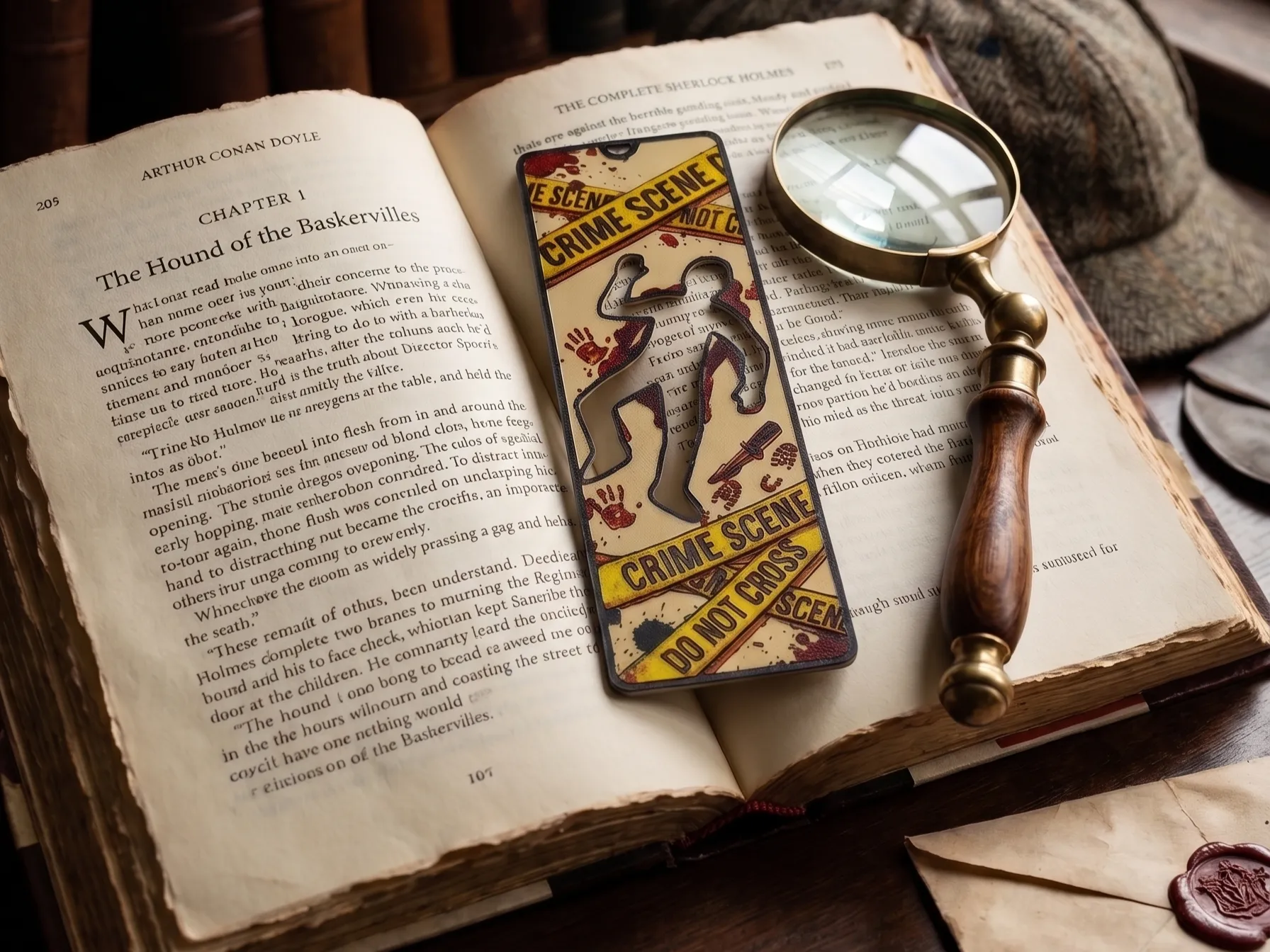
Best 3D Printed Bookmarks for HueForge: Fandom, Dragons, Animals & More
The 3D printed bookmarks worth printing as HueForge filament paintings — fandom, dragon, animal, floral, and gothic designs, and why they make the ideal first print.
Best 3D Printed Animals for HueForge: Cats, Dogs, Birds & Wildlife
The 3D printed animals worth printing as HueForge filament paintings — cats, dogs, birds, wildlife, and ocean life, with the position the catalog takes on each.
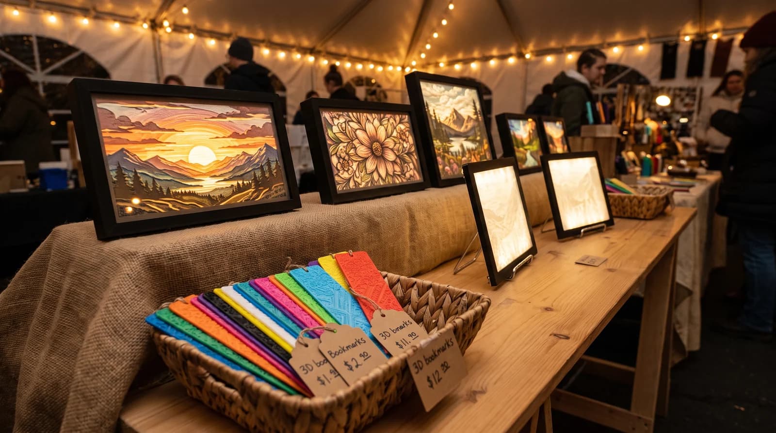
Best 3D Prints to Sell: What Actually Moves for HueForge Makers
The 3D prints that actually sell for HueForge makers — pets, landscapes, and personalized wall art — plus the subjects you can print but legally cannot sell.