
Double Exposure Yin & Yang - HueForge 3 Color
by BoDad
Ancient wisdom flows through this mesmerizing yin-yang composition, where opposing realms merge in perfect harmony. The light half blooms with delicate cherry trees and soaring birds against ethereal skies, while the dark half cradles a luminous full moon above mystical landscapes. Rich earth tones and subtle gradients create stunning double-exposure effects, transforming the traditional symbol into a meditative masterpiece of balance and natural beauty.
View on MakerWorldRequired Filaments3
Why filament details may vary
Filament details (brand, color, and TD value) may not exactly match the designer's original specification. In some cases, the designer didn't specify exact filaments and we've matched the closest options we could find. Always check the original listing for full details.
Some filament links are affiliate links — we may earn a small commission at no extra cost to you. Learn more
Sign up to track your filament inventory and check your matches.
Create accountYou Might Also Like
")
Neon Kaws (HueForge print)
by Houston713Texan

Mandala Hueforge
by Morganja

Swirl Pattern Bookmark
by 3D_Forged

Celebration 250 Tribute 13 Star United States Flag
by tlavedas

Music Hueforge
by Morganja

Violin Hueforge
by Morganja
Recent Articles
View all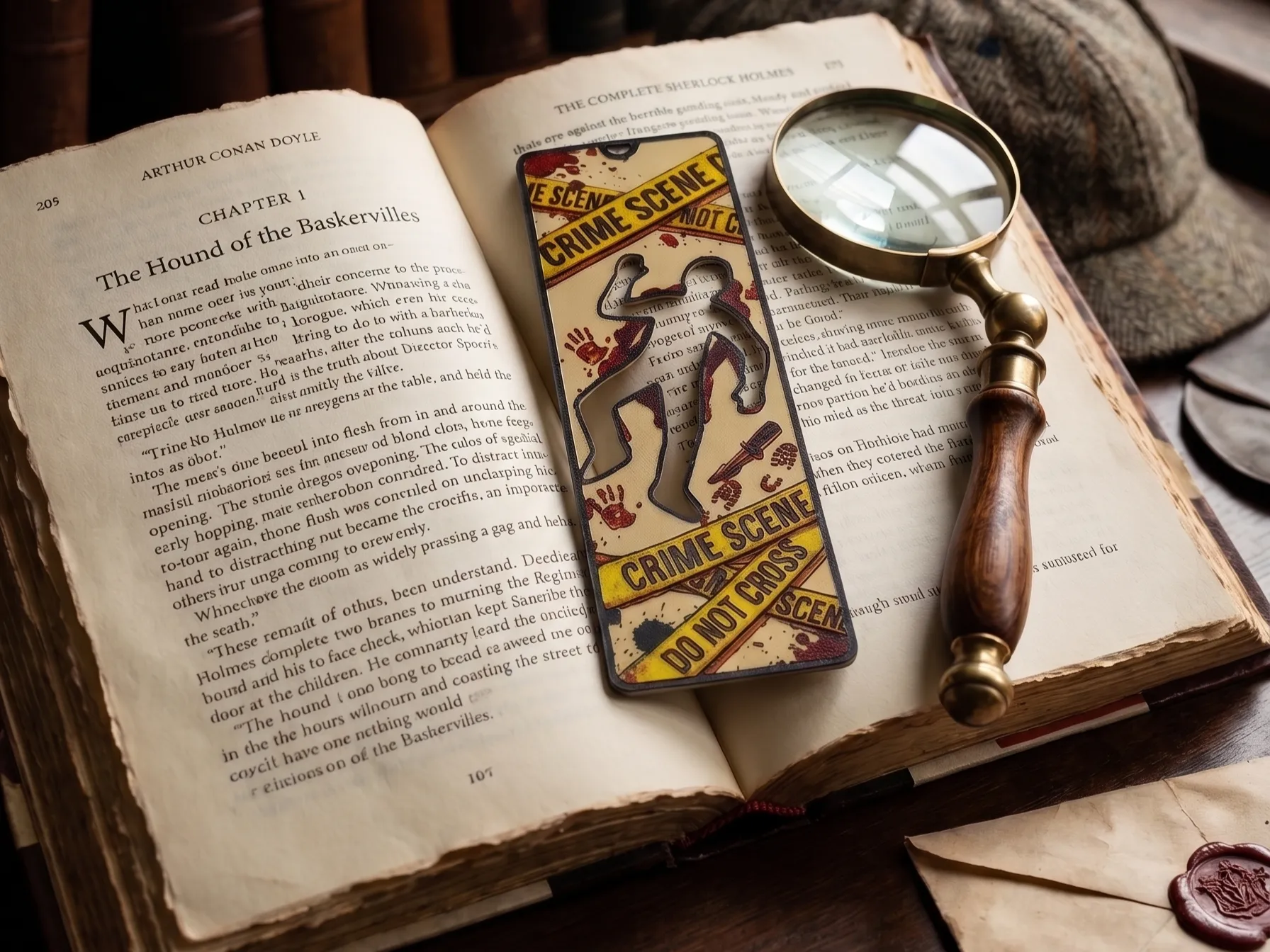
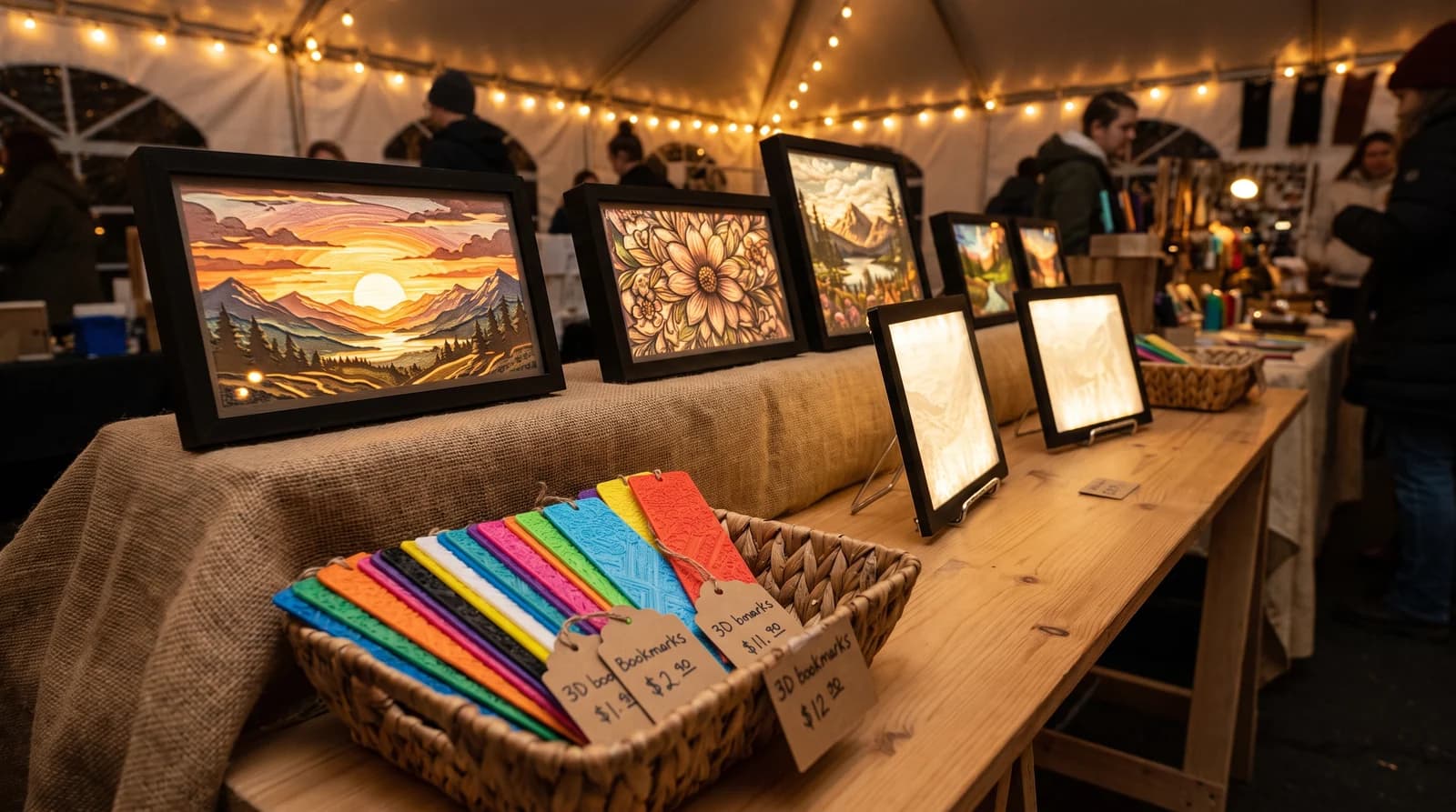
Best 3D Printed Bookmarks for HueForge: Fandom, Dragons, Animals & More
The 3D printed bookmarks worth printing as HueForge filament paintings — fandom, dragon, animal, floral, and gothic designs, and why they make the ideal first print.
Best 3D Printed Animals for HueForge: Cats, Dogs, Birds & Wildlife
The 3D printed animals worth printing as HueForge filament paintings — cats, dogs, birds, wildlife, and ocean life, with the position the catalog takes on each.
Best 3D Prints to Sell: What Actually Moves for HueForge Makers
The 3D prints that actually sell for HueForge makers — pets, landscapes, and personalized wall art — plus the subjects you can print but legally cannot sell.